Friday, January 21, 2011

Dan Perjovschi, "WHAT HAPPENED TO US?"

Photo from THE L MAGAZINE


Another MoMA project.
The one I showed the other day was number 50. This one was number 85, and it was up on the tall white wall in MoMA's lofty atrium during the summer of 2007.

Dan Perjovschi had drawn his cartoons directly on the wall (see video below), and they were printed in this newspaper, of which everybody was free to take a copy. - So of course I did :-)

And since then, I have used it as an introduction to US politics in all the English classes I have taught. I think the image above forms a particularly useful starting point for looking into US politics and for taking a look at how the US perceives the rest of the world...

The images below are political on a more general (and a more or less personal) level.


Photo from artnet


Photo from Colectivo BolaExtra


Photo from pointofview


Photo from PAVILION


Monday, January 17, 2011

Tom Friedman

Tom Friedman, "Untitled", 1990. A partially used bar of soap inlaid with a spiral of pubic hair. Photo from Satchi Gallery.

Getting back to a method I have used before:
I scan my memory for art that I have seen a long time ago. The works that I still remember have made a strong and lasting impression. - Maybe that means that they are particularly interesting, and that you will enjoy seeing them here?

I saw Tom Friedman's sculptural work in the project room at the Museum of Modern Art in 1995, and this bar of soap was the one that fascinated me the most.

- Such a mundane object aesthetiziced by a neatly constructed spiral of pubic hair. - One of the least pleasant encounters you may have in daily life - somebody else's hair on a bar of soap - is turned into enjoyment of a beautiful little sculpture...

- Or does your gut reaction overrule the aesthetic potential?

- Can you see how there seem to be different shades of color in the hair, and how the narrowing spiral on the bar of soap creates an illusion that draws your gaze to the very core of it?

- And what about the white soap as symbol of "the pure", whereas the dark pubic hair tends to symbolize something not so pure...


Tom Friedman, "Untitled (Self-Portrait)", 1994. Carved aspirin. Photo from artnet Magazine.

This work and the next one play on our expectations of scale.

It is impressive that Friedman has managed to carve a little sculpture from an aspirin. But why such a small self portrait? ... One that we could swallow to ease a headache...

A little white sculpture on a white wall, - but still very noticeable. ... Maybe just because it is so little.


Tom Friedman, "Untitled", 1990. Bubble gum, 12,7 cm diameter. Photo from Satchi Gallery.

- Quite a large ball of gum... - Sore jaw muscles?

Look at the subtle nuances of pink color. - And that even, shiny surface...


Tom Friedman. Photo from playgrounddoor.

I cannot remember either of these last two works from the 1995 project at MoMA. They may not have been there. But they are beautiful.

The red, gold and blue in this pencil sculpture, - and the beautiful proportions... a perfect grid....


Tom Friedman, "Untitled", 1993. Plastic cups, 101,6 cm diameter. Photo from Satchi Gallery.

This circle of plastic cups looks like it has some very interesting plastic properties...

Friday, January 14, 2011

Edvard Munch, "Munch - Master Prints" at Bergen Art Museum

Edvard Munch, "The Scram", photo from Trykk of foto 3SF.

Edvard Munch made so many versions of "The Scream", from which so many reproductions and so much paraphernalia have been produced, that I find it very hard to look at this work with fresh eyes, - even when I stand face to face with one of the original versions at a museum.

- As I did yesterday, in Bergen Art Museum's exhibition "Munch - Master Prints". Unfortunately, I have not been able to find any downloadable version of that particular work, but you can see a detail of it here.

What struck me when I viewed the image from a distance (it hangs on the end wall in a narrow rectangular room), was that even though it is a lithograph, it resembles a woodcut. The strong vertical and diagonal lines in the bottom half of the picture look like they are carved out of wood, and they form a dramatic contrast to the softly waving horizontal lines in the quiet background landscape.

Seeing a carefully hand colored version of this print was quite refreshing. Just a few blue and orange lines between all the black ones make a great difference. The subtle orange color that Munch added to the sky, gives it a warm evening glow, which is reflected on the contours of the suffering face.


Edvard Munch, "The Sick Child", 1896, lithography. Photo from Listen. (Same image, but not the same print.)

While there was only one version of "The Scream" in the "Munch - Master Prints" exhibition, many of the titles were shown in several versions, for instance "The Sick Child". It was interesting to see prints with different color combinations placed right next to each other. But what I found most enjoyable in all the "Sick Child" prints, was the way their simple composition as well as Munch's rendering of light, made me focus on the girl's face and on the reflection right in front of her face.


Edvard Munch, "The Sick Child", 1885-86. Photo from Nasjonalmuseet.

- Much more than I do when I look at the "Sick Child" painting Munch finished ten years earlier.


"Edvard Munch: Master Prints",  National Gallery of Art, Washington DC, July 31 - Oct 31 2010. Photo from France24.

The prints are hung in series, on dark walls, with scarce lighting, in much the same way as you can see on this photo from a similar exhibition at the US National Gallery of Art. And walking quietly through the darkness where the prints are lit by dim spotlights, you become intimately confronted by eerie and private subject matter.

Five different "Madonna" prints are shown, but I have seen that image so many times already, and this exhibition did not make me discover anything new about it. So instead of posting a "Madonna" here, I will show you a print that I cannot remember having seen before.


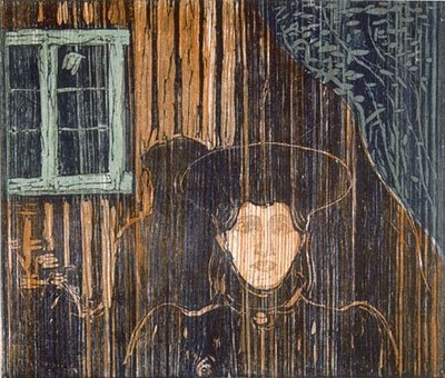
Edvard Munch, "Moonlight", woodcut, 1896. Photo from A Polar Bear's Tale.

There are three versions of "Moonlight" in the exhibition, and they are quite different in regard to the rendering of light and the visibility of wood structure. - Quite amazing how Munch has managed to make the woman's face glow with moonlight by carving wood and putting some ink on it, don't you think?

Tuesday, January 11, 2011

Tino Sehgal at Kunstnernes Hus in Oslo


In yesterday's post I complained that I have never had a chance to experience a work by Tino Sehgal. Well, today I found out that he will come to Kunstnernes Hus in Oslo at the end of this month for a conversation with two art historians (January 28), and an exhibition (January 29 - March 6).

So should I book a flight that takes 50 minutes or spare the environment by sitting on a train enjoying mountains and woods for 6-7 hours?

Monday, January 10, 2011

Tino Sehgal

One very positive consequence of blogging is learning a lot from blogs that I read. And while having been mostly stuck in Bergen, Norway the last ten years, I have missed out on quite a bit. For instance: Tino Sehgal.

David M. Heald © SRGF, New York. (the village VOICE)

This (illicit!) photo (replaced by a photo of the Guggenheim rotunda) shows his living sculpture "Kiss", in which dancers were hired to execute a very slowly evolving embrace that lasted throughout the museum's opening hours, every day for a month and a half. The work is owned by the Museum of Modern Art and was loaned to the Guggenheim as part of its 50th Anniversary celebrations early last year. But there exists no official photographic documentation of "Kiss" or of this particular effectuation of it, and as an attempt to counteract the material commodification of artworks, Sehgal sells his works exclusively by oral agreement, without any written contracts. (For critical comments about this strategy see: ARTslanT and Escape Into Life.)

While this and one other work by Sehgal were shown, the Guggenheim rotunda was empty for the fist time since it opened to the public 51 years ago (there were no other artworks to be seen), and the photo gives a good impression of Frank Lloyd Wright's beautiful architecture (which I mentioned in a recent post about Felix Gonzalez-Torres). Sehgal's work not only thrives from being shown at the Guggenheim like Gonzalez-Torres's did in 1995, the second work by Sehgal that was shown there last year requires participation from the audience in a similar way as Gonzalez-Torres's work does.

That second work is titled "This Progress", and exists only as individual conversations with the audience. Actors of different ages (a child at the bottom and a person in late middle age at the top) accompany visitors on their way up the spiraling rotunda while engaging them in conversations about progress. I would have loved to try this out myself and to describe my experience here, but since I have not had the chance to take part in "This Progress", I will rely on Holland Cotter's story from The New York Times:

It begins when you walk a short way up the rotunda ramp. A child comes over to greet you. My greeter, a girl of 9 or 10, introduced herself as Giuliana and stated matter-of-factly, “This is a piece by Tino Sehgal.” She invited me to follow her and asked if she could ask me a question. “What is progress?” I gave a broad answer, then at her request, a clarifying example. We went further up the ramp.

Soon we were joined by a young man, a teenager, who said his name was Will. Giuliana carefully and accurately paraphrased for him my response to her question and slipped away. I walked on with Will, who commented on my comments on progress, which prompted me to try to refine my initial thoughts.

About halfway up the rotunda, Will was replaced by Tom, whom I took to be in his mid-30s and who introduced a new topic.

He had read a scientific report that morning saying that dinosaurs, long envisioned as drab-gray and green, might have been brightly colored, even gaudily striped. We had both, we said, been fascinated by dinosaurs as kids, as was his young son today. And now everyone would have to reimagine them, though artists already had done that. So Maurice Sendak’s “Where the Wild Things Are” turns out to be natural history. Art beats science to the punch.

As we neared the last stretch of the ramp, Tom handed me over to Bob, who was, like me, in late middle age and who broached another topic. He had just returned from Bulgaria where he had talked with a range of people over 20 about their feelings about the state of their country and lives. He found, he said, a pervasive nostalgia for life under Communism, a yearning for a society that promised to take care of everyone.

The Guggenheim Museum says about this requirement for the audience to participate that "a visitor is no longer only a passive spectator, but one who bears a responsibility to shape and at times to even contribute to the actual realization of the piece".

Friday, January 7, 2011

Anne Teresa De Keersmaeker

I have been searching widely on the web - but in vain - for a video of Anne Teresa De Keersmaeker's "Stella" (1990). When she was visiting Bergen with her company Rosas and this piece (in 1990 or 1991, I cannot quite remember), I liked it so much the first and second time I saw it, that I ended up seeing it three times.

Visually stunning (100 metronomes on stage that played Gyorgy Ligeti's "Symphonic Poem for 100 metronomes", and sharp, elegant costumes with skirts and high heeled shoes) "Stella" still stands out as one of the strongest stage works I have ever encountered. So I would have loved to see it again. - Anybody out there who knows how?

The New York Times called it "...a multilevel essay on how context changes meaning, especially with respect to how women are regarded by others and themselves".


This video shows part of a well directed film (by Thierry De May, 1997) which is based an earlier piece by De Keersmaeker for Rosas: "Rosas danst Rosas" (1983).

Enjoy!

Tuesday, January 4, 2011

Felix Gonzalez-Torres


New year. Clean slate.
I will fill this first one with Felix Gonzalez-Torres, and focus on the possibilities he has given me by handing out candy and posters.


Felix Gonzalez-Torres, "Untitled" (Placebo), 1991. Photo from: Chicago Art Collection.

I have come across his candy in many different exhibitions (among them: Guggenheim, New York, 1995; Astrup Fearnley Museum, Oslo, 2002; Venice Biennale, 2007).

The first time I stood next to one of his shining carpets that look like minimalist sculpture, but are made from sweets wrapped in cellophane, I had to figure out whether or not it was ok to take one. And the moment of insecurity that I experienced then, is a very important aspect to all his different candy pieces.

Well, the answer is: - Yes!


Photo: Ramiro Quesada.

But then another question emerges: - How many will it be ok to take?

Getting something for free like that, in a situation which tends to be about not touching very costly artwork, inspires thoughts about the artwork as a commodity, and about modesty versus "unlimited" sensuous pleasure.

In Felix Gonzalez-Torres's work, mouthfuls of hard, sweet candy, when put together in great numbers, neatly shaped on a gallery floor, become pieces of installation art that not only challenge our desire to own and acquire. They also carry a distinct political message which I will get back to at the bottom of the post.


Felix Gonzalez-Torres, "Untitled" (Golden), 1995.
Photo from: Makurrah's Blog

This golden curtain of beads on strings forms a beautiful, gleaming surface. Its shape is very simple, - like the candy carpet above. And - like the candy piece - it requires viewer participation: It needs your body to brush through the beaded strings. You may be curious about what you can find behind the curtain, but it is most important that you savour the moment when you feel the weight of the beads against your hair and your skin...


Felix Gonzalez-Torres, "Untitled" (Golden), 1995 (detail).
Photo from: Makurrah's Blog


Felix Gonzalez-Torres, "Untitled" (Passport), 1991. Photo from: Leaving Traces.


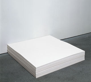
As far as I remember, the 1995 retrospective at Solomon R. Guggenheim Museum in New York was the first time I encountered Gonzalez-Torres's work. And I remember very well the inspiration I felt as I sat down somewhere on Frank Lloyd Wright's spiralling floors to fold the blank sheet of thick paper I had picked up from one of the stacks that were displayed. I could take a part of Gonzalez-Torres's sculpture and add something to it. Not really making it my own, but helping it fulfil itself...


Photo from Makurrah's Blog.

Here somebody is rolling up a sheet from a stack of printed paper.


Photo from adrienneskye's photostream: "Felix Gonzalez Torres in Paola's Room".

And here is where another sheet from the same stack ended up.


Felix Gonzalez-Torres, "Untitled", 1991. Photo from: DCUBANOS.

This photographic billboard serves well as an example of Gonzalez-Torres's attention to context. The very intimate subject matter of the huge photo is accentuated by its harsh urban surroundings and by the contrast it forms to the commercial images we are used seeing on billboards. Walking down the concrete pavement, glancing up at the board, one may be reminded of one's own feelings and thoughts about love and intimacy, and the private will then stand out as soft and fragile against the public streetscape.

But knowing that Felix Gonzalez-Torrez lost his partner to AIDS prior to the making of this work, and that he died from AIDS himself in 1996, our reading of this billboard takes another direction, towards notions of loss and a focus on prejudice against gay love.

The same perspectives can be applied to his candy work. With these biographical facts in mind, the title "Untitled" (Placebo) gets a more literal meaning, perhaps referring directly to the substitution of lost love by sweet candy.

(More about the "Placebo" series at the International Sculpture Center and the Williams College Museum of Art)